Epiroc
Contribution
Strategy & Concept
Visual Identity
Webb
Finished
April / 2024
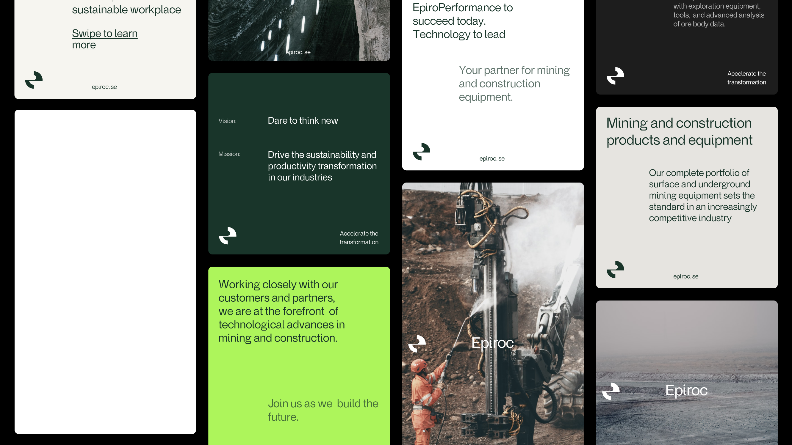
In alignment with Epiroc's strategic positioning to "Accelerate the transformation", this rebranding initiative aimed to enhance their stance as leaders in sustainable mining and construction. The project's focus was to reflect their commitment to innovation and sustainability, encapsulated in their mantra, "Dare to think new".
Creating space
The redesign of Epiroc's brand identity is anchored in the idea of creating space which underscores Epiroc's dual role in the mining industry. This concept is both literal and metaphorical, highlighting not just the physical extraction of resources but also the creation of potential and opportunities. It encapsulates Epiroc’s commitment to expanding boundaries and exploring new possibilities within and beyond mining.
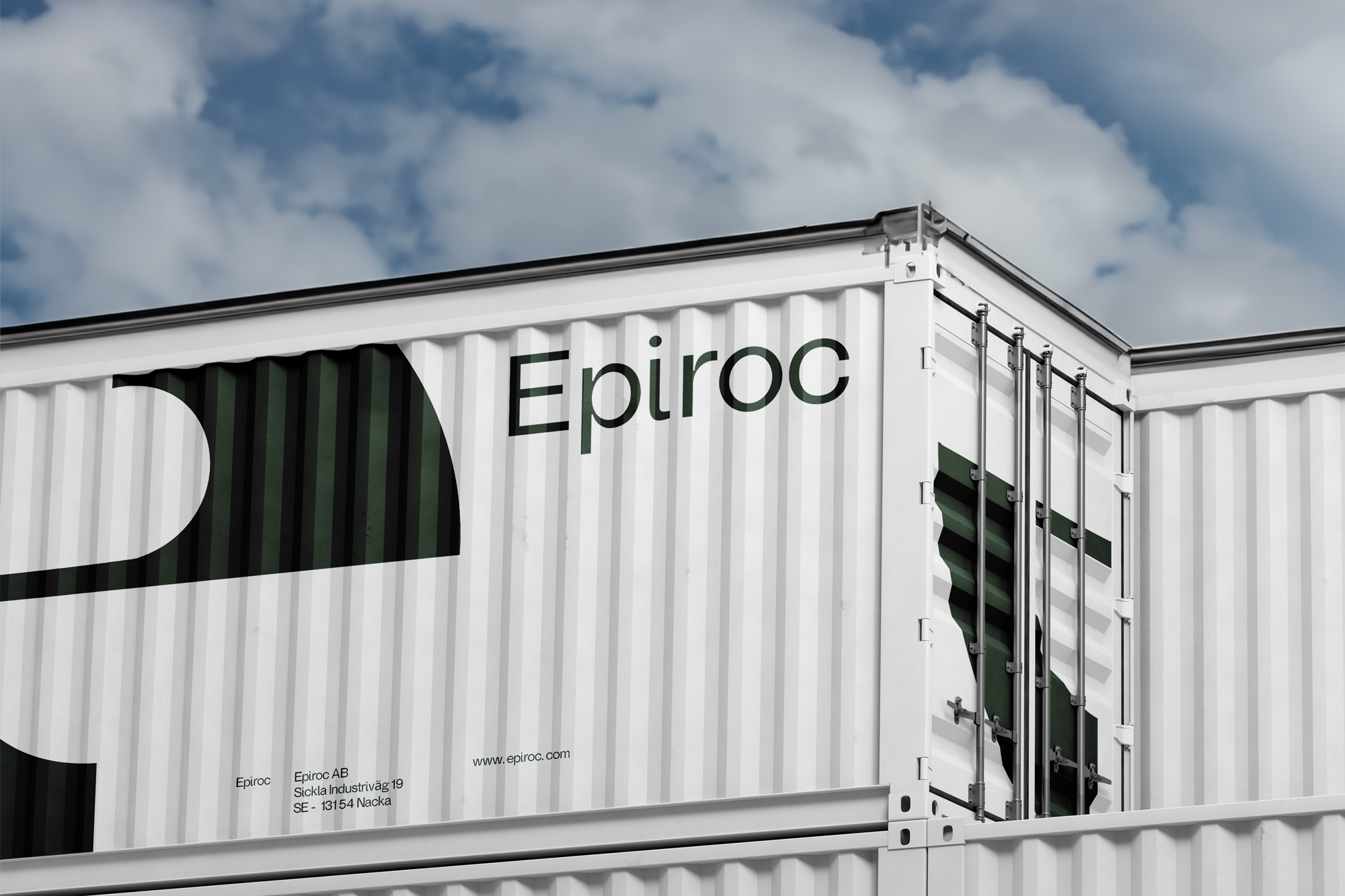

Redefining space with design
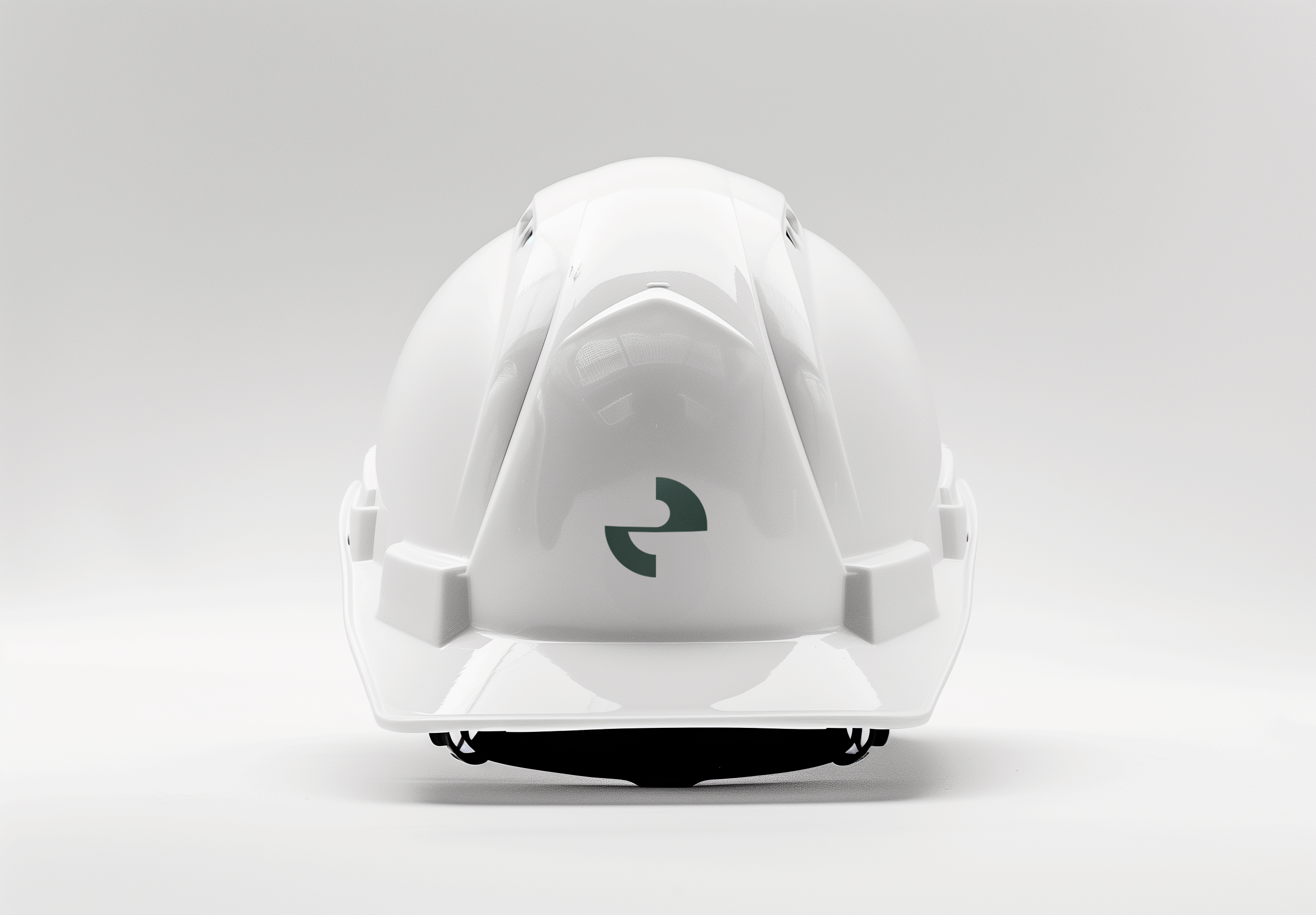
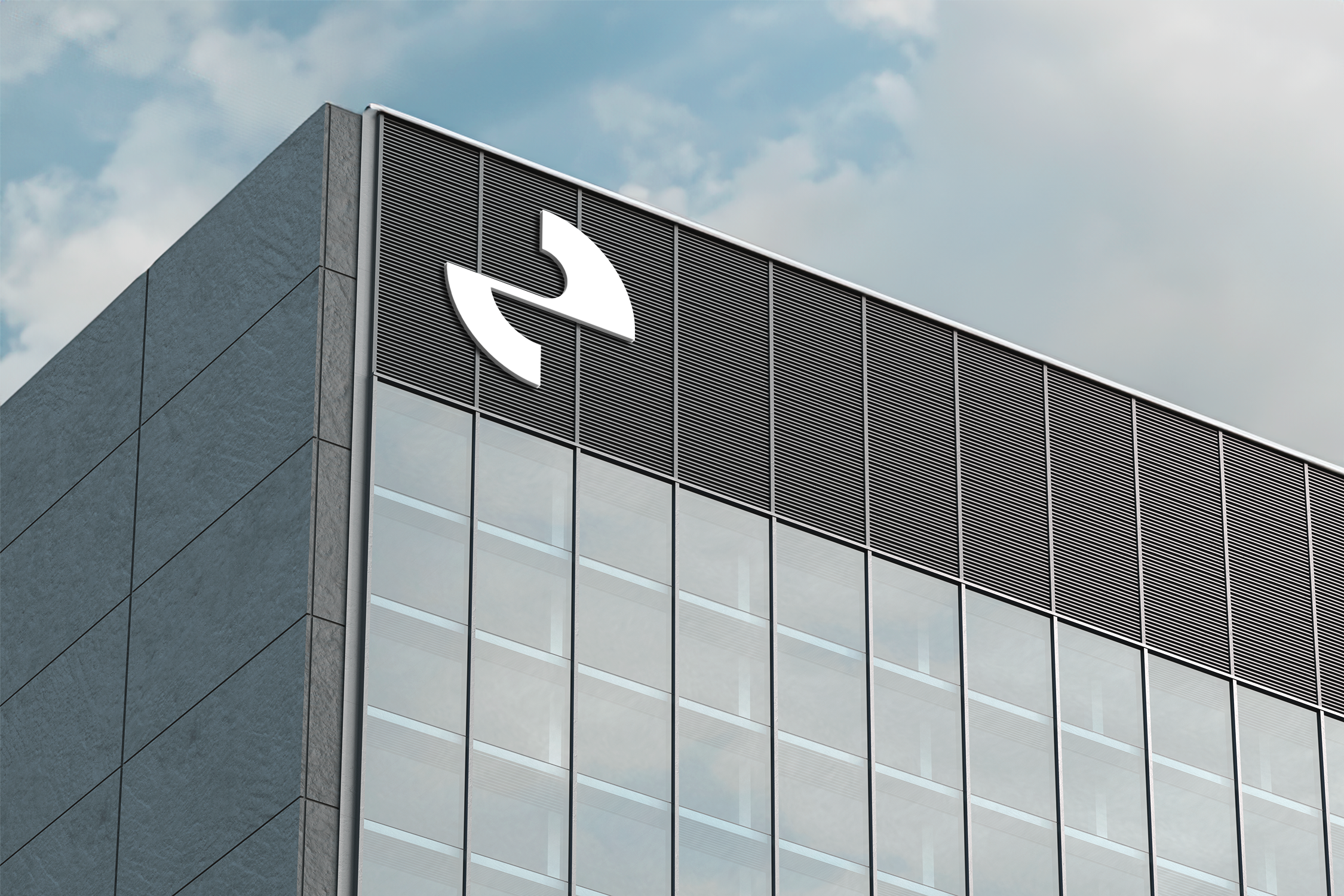
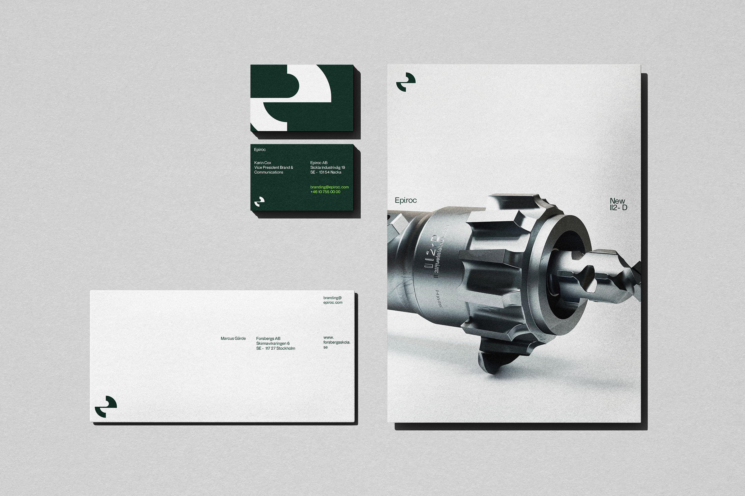
The logotype designed with negative space aims to reflects the company's ability to create
expansive opportunities through advanced technology.
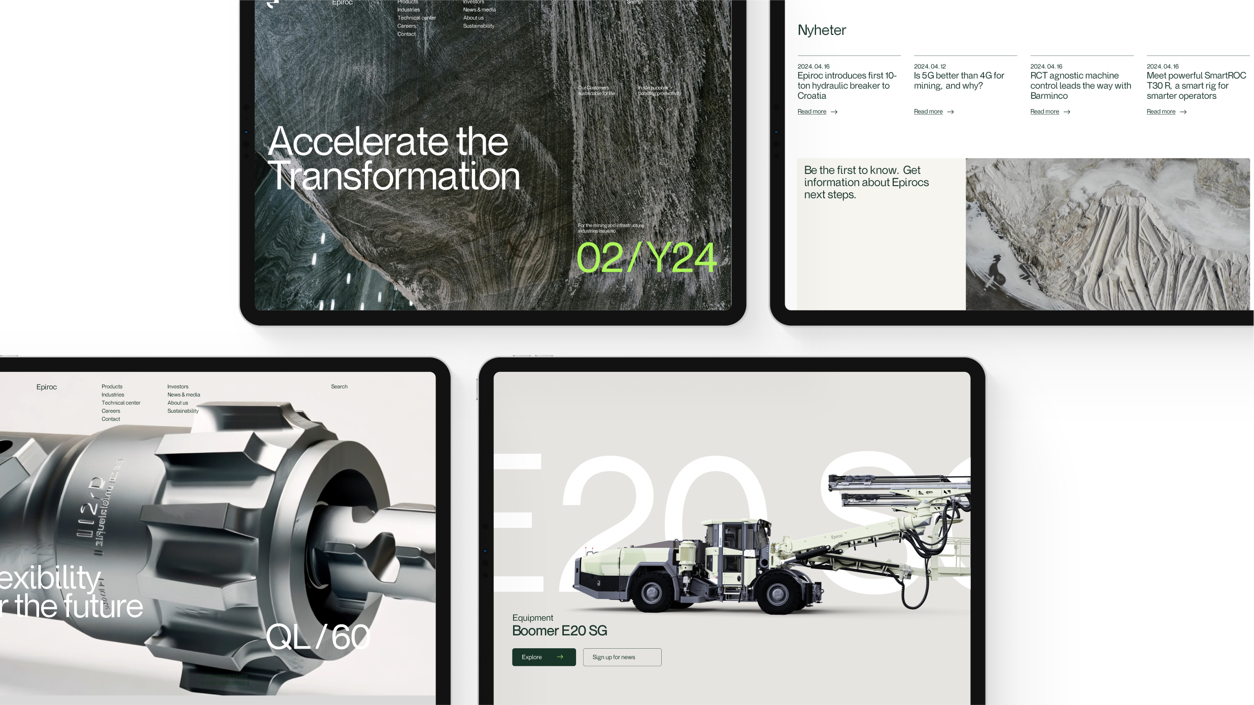
For the project Epiroc Sans was made
to enchant distinctivness. Featuring
drilling traps instead of traditional ink traps, directly ties to the mining industry. In
marketing materials, strategic visual spacing emphasizes themes of innovation and growth,
with
all design elements reinforcing the concept of
creating space.

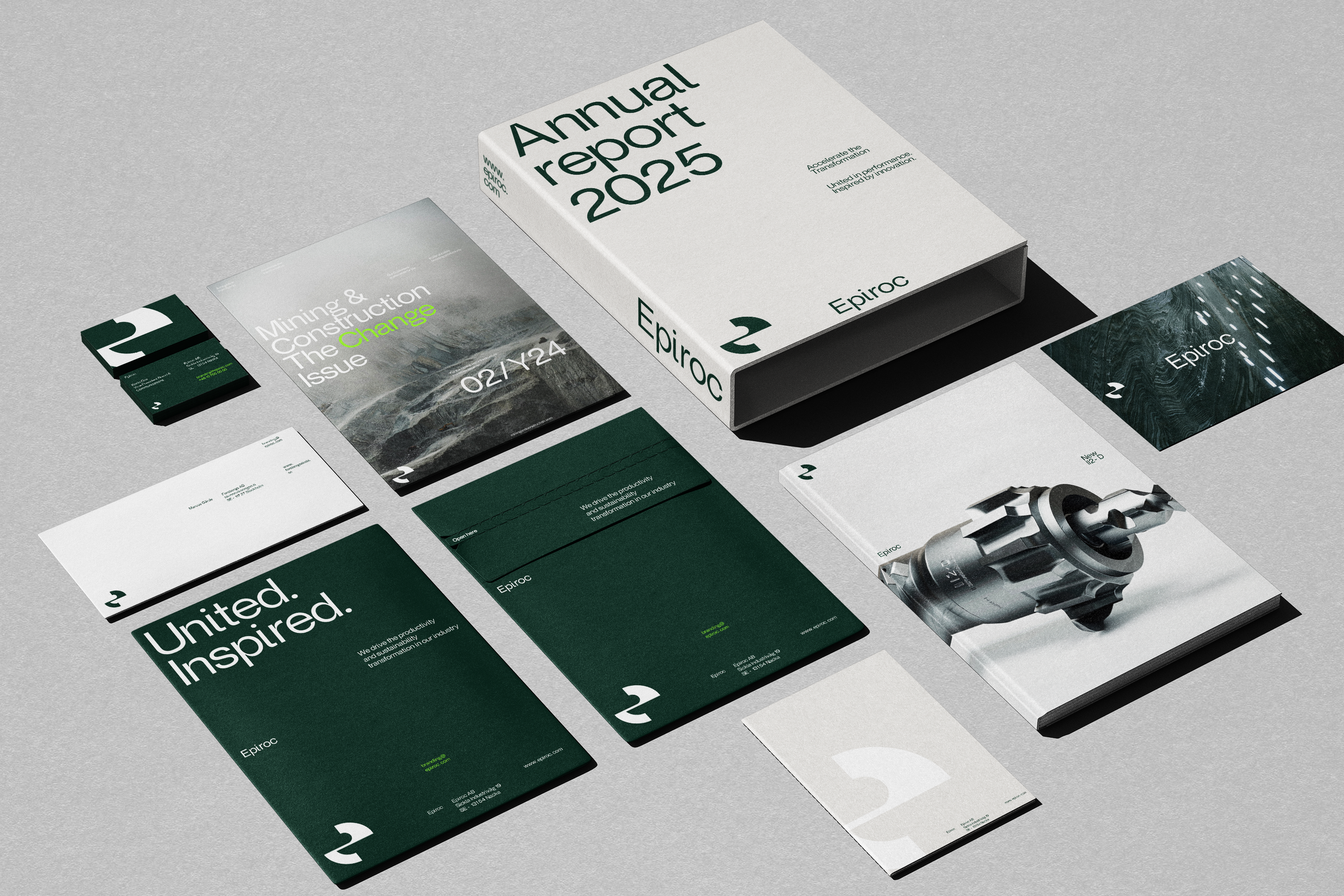

Color palette
Epiroc's color scheme reflects its unique industry
stance,
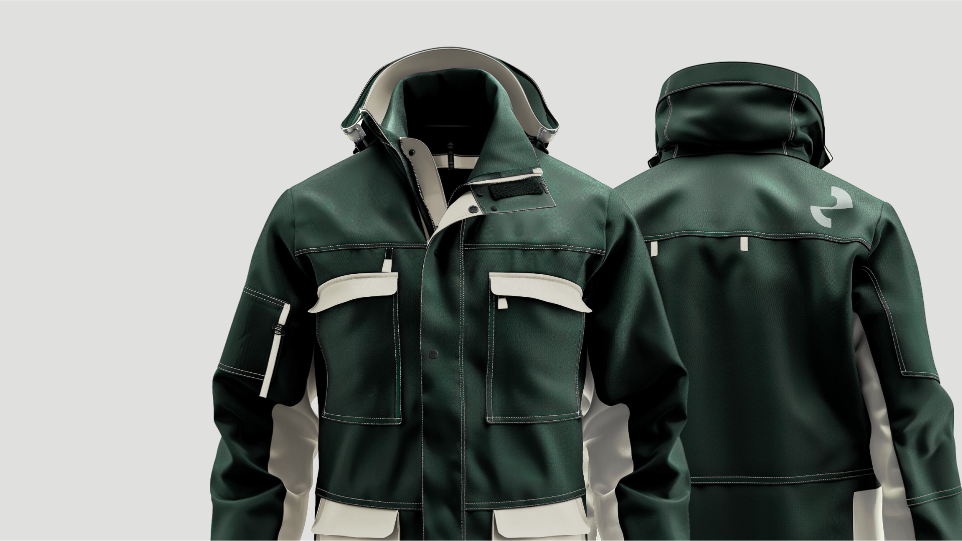
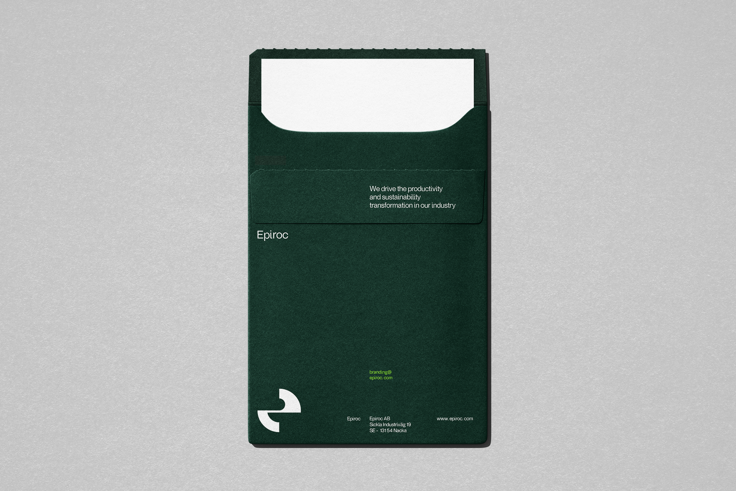
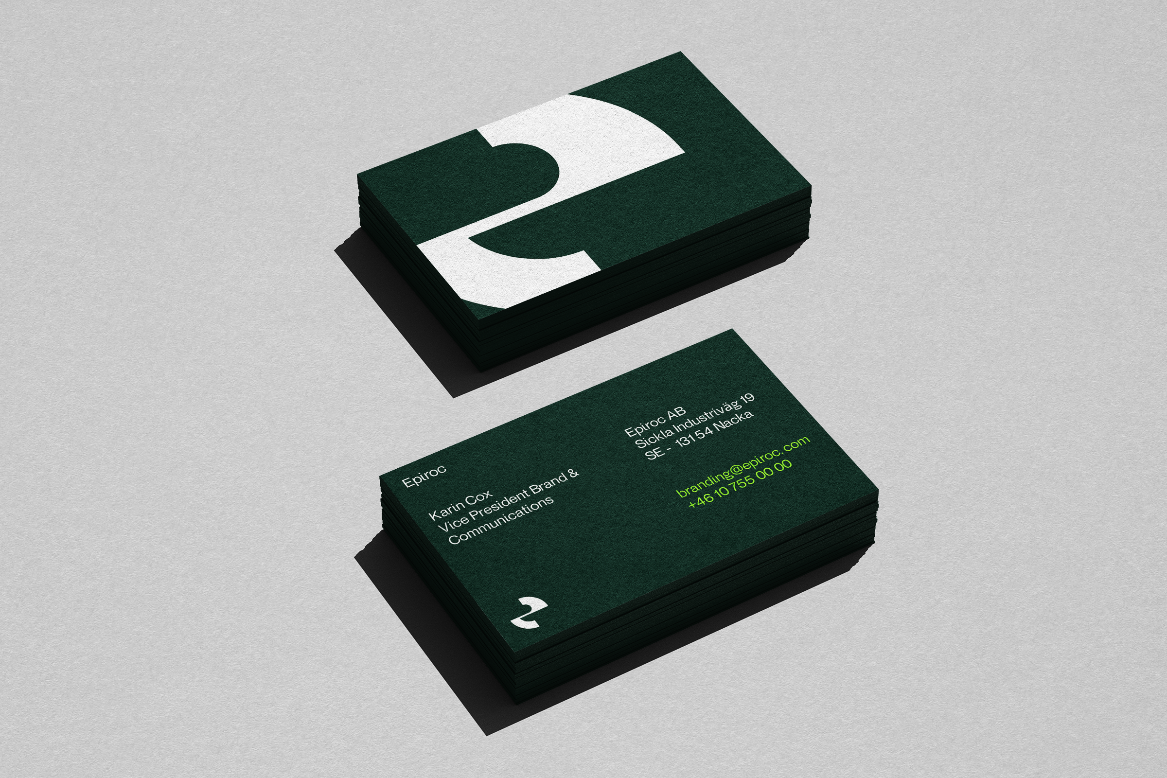
with "Rock Green" showcasing confidence and distinctiveness. Meanwhile, the vibrant
"Accelerating Green" stands out as a dynamic element, used strategically to draw attention
and
signify action— when a visual boost is needed.
